Sunday, October 30, 2016

Awareness Poster Part 2: Anxiety

I only made a few small changes to the original.  I thought that the girl in the picture looked a little boring, so I added a blend mode to that layer and smudged her a little bit to create a little visual confusion.  It's meant to have an impressionist effect.

Here is the final image:


Overall, I think that the image conveys the emotions I wanted it to convey.  I wanted it to evoke anxiety, and make the viewer nervous.  I wanted all the text to overwhelm the viewer, and for the viewer to see the girl and feel her confusion and pain.  I really like the results, and I hope you do too.

Awareness Poster Part 1: Anxiety

I did my poster on anxiety.  I think that mental health conditions are under-treated and underestimated.  I suffer from anxiety myself, and sometimes I find that people are insensitive towards the condition.  Many people suffer from both anxiety and depression, and I think that just now (in history) people are starting to move towards acceptance of these conditions.
Here is my sketch:


Here is the one image I used in creating the poster:


Here is my preliminary image:

Any feedback is welcome.  I typed all the text myself based on personal experiences and anxiety attacks I have experienced in the past.  In my final draft, I will likely not make very many changes, as I like how this draft turned out.

Photomontage Part 2: Wicked Chicken

I took my preliminary image and used some of the layer blending options to unify the color a bit more.  Many of the layers are individual images copied on top of each other, then blended with the multiply blending option to make it a little darker.  I wanted the final image to be a bit more grungy and darker than the preliminary image.  I also wanted to add a little more "excitement" to fill up unused space. 

The final image:


Overall, I wanted this project to be a little bit goofy and I wanted it to emulate other heavy metal band album covers that I've seen and thought were funny (even though they weren't trying to be).  I think the image turned out good.  I'm looking forward to applying these principles that I learned with this project to other projects in the future.

Photomontage Part 1: Wicked Chicken

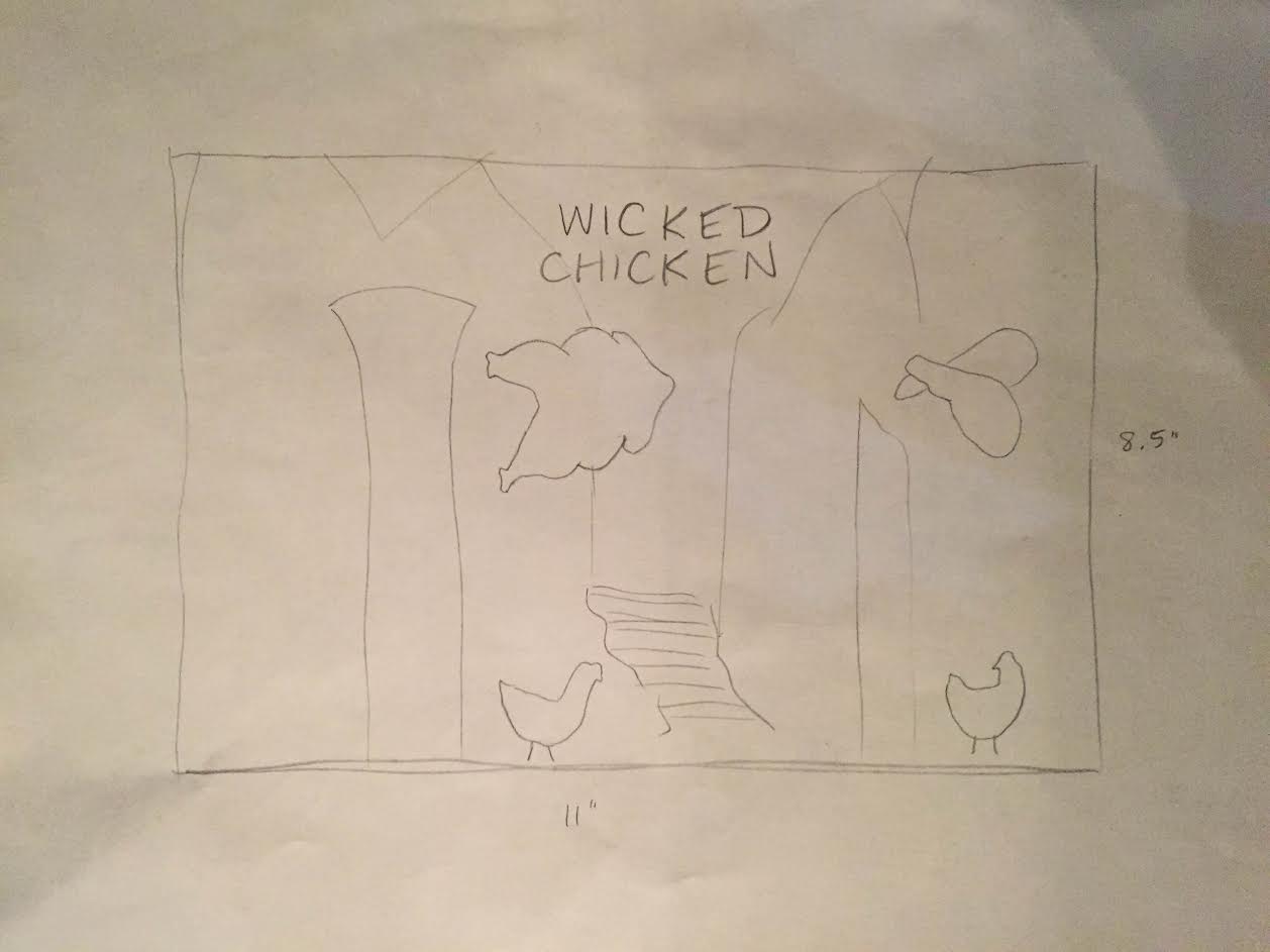
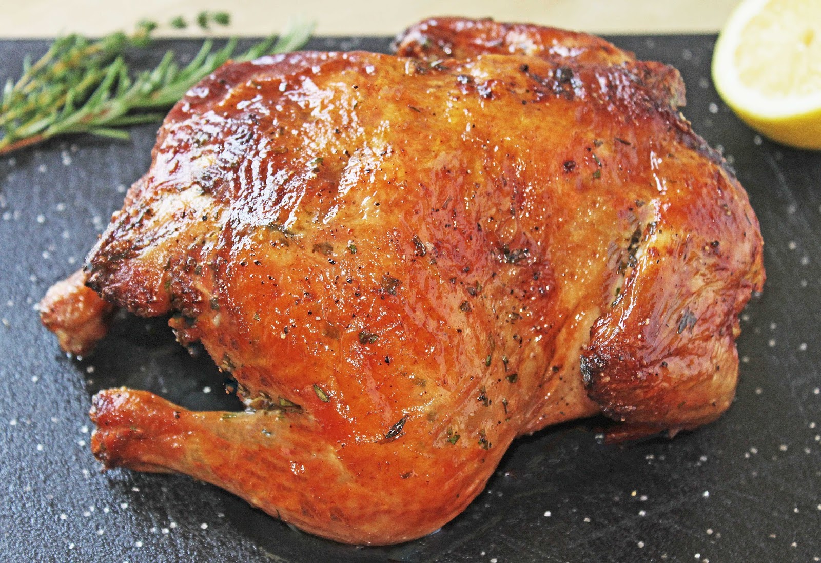
I chose to do my album cover on a fictitious band entitled "Wicked Chicken."  They're apparently a heavy metal band, based on my original idea of having chickens at the gates of hell.  I first picked out the images I was going to use, then made my sketch. I realized I had too few images and added another after making the sketch.  Then, I created the preliminary image by using selection tools and blending some of the images in to the background with the Eraser tool.

I found the draft image to not have enough unity in color.  The images didn't blend together as well as I'd like them to, so those are the edits I'll be making with my final image.

The sketch:


Image 1:


Image 2:


Image 3:


 Image 4:


 Image 5:


Image 6 (background):


Preliminary Image:


Overall, I feel the design is a good start.  There's a lot missing from this preliminary image, but it does have good placement of the images, and the colors aren't too far off from making the image a little more fluid and put-together.